Negative space referred to as white space, is crucial in creative design. This subtle yet powerful concept is the unused area surrounding or within design elements. It is far from 'empty,' and occupies a necessary function in artistic and visual expression and communication. It doesn't matter whether you are a designer or just a casual observer, knowing how negative space affects a design’s balance, clarity, and emotional impact will help you appreciate the craft more.
Negative space is the area that is left untouched around design elements, at its core. It is not wasted space but rather complements the positive space, the main subject of the design. They work together creating a composition that shares meaning and catches the attention.
Enhancing Visual Balance
Negative space is crucial to achieving balance in creative design. This helps to offer room between components by ensuring the design appears manageable. Designers help the viewer’s sight and maintain a sense of order by positioning the negative space.
Picture a logo with a single bold element floating in a sea of space. This approach makes the element stand out and makes the design clear and simple.
Improving Readability and Focus
Negative space isn’t just about how it looks; it’s also about how it functions. For example, negative space helps develop readability in typography. Then they can read and digest that text more easily when spaced correctly.
Negative space is very commonly used as a design tool to give focal points some extra oomph. For example, a well-placed image or headline with space around it can immediately attract the viewer's attention and the message becomes more powerful.
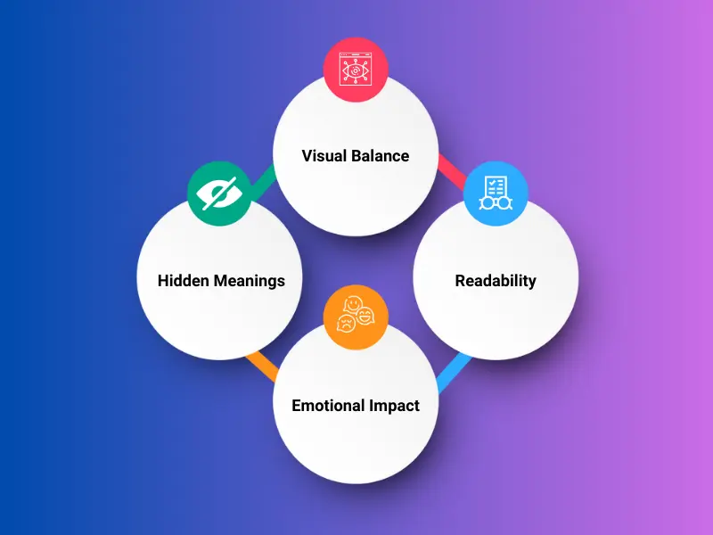
Creating Hidden Meanings
Some of the most iconic designs use negative space to hide messages or meanings. Often these subtle nuances delight audiences, and as such make the design more memorable. Imagine logos that have white space that forms hidden shapes or symbols — these designs become conversation starters and prove the designer’s creativity.
Enhancing Emotional Impact
Negative space can describe a mood or tone. Clean, modern, and professional are often associated with minimalistic designs with a lot of negative space. Crowded designs can make someone feel stressed or chaotic, in contrast to something else. Designers can use negative space to tailor their work to create specific feelings.
1. Logos and Branding: Negative space makes logos timeless and versatile.
2. Web Design: Spacing between elements creates user-friendly interfaces.
3. Print Media: Negative space highlights key content in posters or ads.
By understanding the practical applications of negative space, designers can make informed decisions that enhance both functionality and visual appeal.
Negative space fuels creativity by encouraging designers to think creatively. Instead of adding more elements, they can make stunning results by eliminating clutter and simplicity. Negative space is the art of craftily using less to prove that more is less.
Negative space focuses on the background feature which is a crucial design tool that helps to improve balance, emotional connection, and readability. Designers create compelling visuals that communicate effectively and leave a lasting impression by developing this concept.